→ Courtyard M8
The brief asked for a new organisation of a courtyard within an old Wilhelminian house situated in Münzstrasse 8, Berlin-Mitte. A clever, atmospheric solution for the location of bins and bike parking was the clients main interest.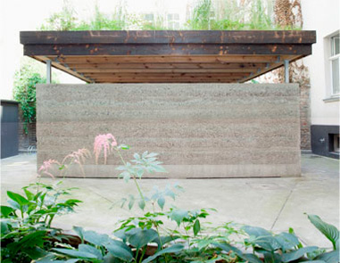
↓ Courtyard M8
The brief asked for a new organisation of a courtyard within an old Wilhelminian house situated in Münzstrasse 8, Berlin-Mitte. A clever, atmospheric solution for the location of bins and bike parking was the clients main interest.
The possiblities for new plantation and green areas was limited as a basement is situated below the entire courtyard not allowing for much depth.
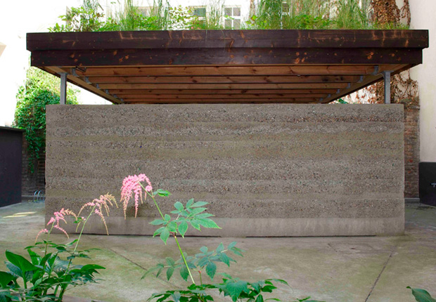
The basic idea is a new concrete surface, with a finely chiseled surface which over time allows for different ratios of mosses and lichens. A long planter is placed on the surface itself with a surrounding circular wooden bench.
The house is attached to the neighbouring partition garden wall to the rear of the courtyard, which creates a more generous impression of the limited space available.
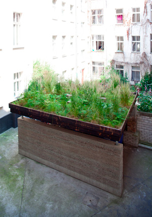
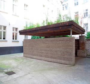
The appearance of the house is marked by the sensuous materiality of the stamped concrete wall,the solid timber construction, the green roof and the long planter. The stamped concrete wall was built in 20 cm high segments per day by hand and is reinforced with recycled glass in various colours.
The wood of the green roof is flamed for aesthetic reasons and to protect it from excessive weathering.
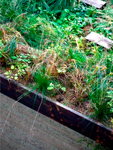
The roof is planted intensively with various plants, shrubs and grasses, which creates different color schemes and scents every season and to give the whole place a distinctive atmosphere.


→ Music Hall St. Margareten
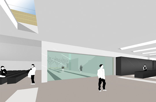
The basic idea of the draft is a striking building that incorporates the parameters of the existing urban conditions and connects the different spatial and programmatic situations.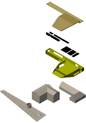
↓ Music Hall St. Margareten
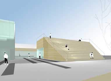
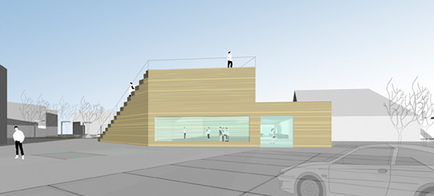
The spatial volume of the new building is modeled on the proportions of the public buildings in its environment and fits naturally into the urban context. The newly added building completes the existing ones to a harmonious ensemble that is in its presence and significance the new cultural center of St. Margareten. The functions are distributed on the one hand in the event hall and on the other hand in the long lobby, the service functions and public programs which are also the spatial connection between the old inn and the inventory. The appearance of the whole is shaped through the dialectic of the linear lobby wing and the punctual component of the Hall. The Halls façade to the square becomes a spacious staircase to its rooftop and extends the marketplace spatially to the Hall. It gives this space a third dimension: the square becomes a stage and the Hall its grandstand. Between the old inn and Hall is a beautifully proportioned courtyard which opens to the marketplace, a sunny garden that defines the southern access to the new building.


→ Apartment M405
Apartment M405 is located in the attic floor of a boarding house in in the historic center of Berlin.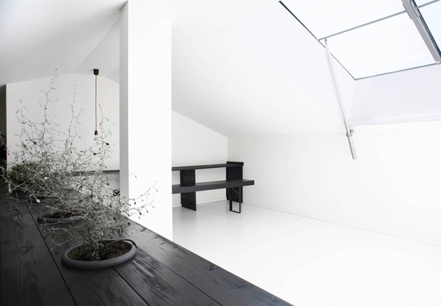
↓ Apartment M405
Apartment M405 is located in the attic floor of a boarding house in the historic center of Berlin. It consists of two levels, a lower one, where the living and dining areas, as well as bathing and sleeping are situated and a gallery level. A large electric opening roof-window provides natural light for the gallery level in the attic space.
The gallery can be used as a work space or just for contemplation. The task and challenge was to setup the apartment with a small budget, to complete and grade up the existing architectural design and create a specific identity and atmosphere. The initial point for the interior design was to homogenize the disparate elements of the existing situation and to provide the intrinsic small apartment with a really unexpected generosity and Size.
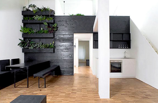
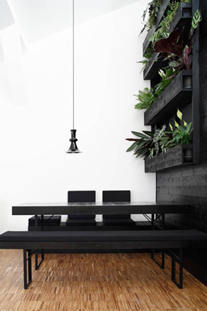
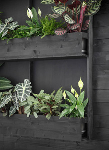
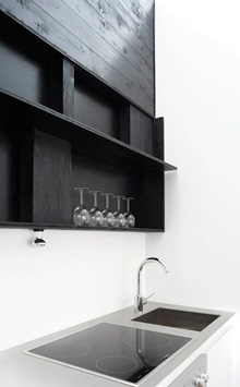
A multi-functional wall of oiled black pine is on one side of the two storeyed apartment the construction basis of an indoor balcony greenery, on the other side the kitchen shelf and then folds in the gallery level to a parapet filing desk. The black wooden wall structures the whole room and sets a calming counterpoint to the distinctive pattern of the existing flooring. At the same time it hides the automatic irrigation system of the interior greenery.
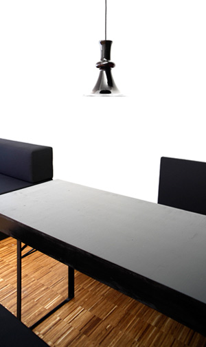
The furniture consists of a modular system made out of variably sized, portable wooden boxes with seat cushions that can be combined to nearly infinite different spatial situations. The dining table and benches have the same surface of oiled pine like all other elements of the interior intervention. The reddish-black leaf bottom sides of the plants are of the same color than the light of the Holmegaard glass lamp from the 60s. They match the perfect picture of an atmospherically dense monochrome and minimalistic heterogeneity.

→ Curator's Library HKW
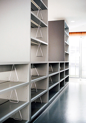
Documentation Centre/ Curator’s Library, Haus der Kulturen der Welt (HKW), Berlin. The former post office in the basement of the Haus der Kulturen der Welt including the listed phoneboxes are converted into a curator’s library and reading/media space. Work involves the concept and design of the interior and furniture.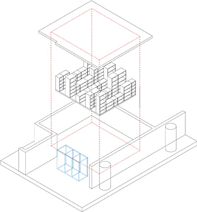
↓ Curator's Library HKW
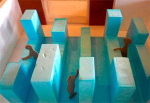
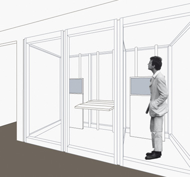
Documentation Centre/ Curator’s Library, Haus der Kulturen der Welt (HKW), Berlin. The former post office in the basement of the Haus der Kulturen der Welt including the listed phoneboxes are converted into a curator’s library and reading/media space. The listed telephone boxes will be renovated and refurbished to be turned into a media lab. The work also includes the design of new foldable, modular library tables to create a reading area, which can easily expand and spread into the open space in front of the library.
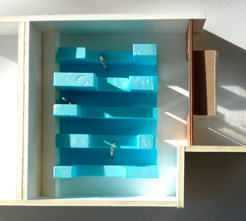
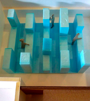
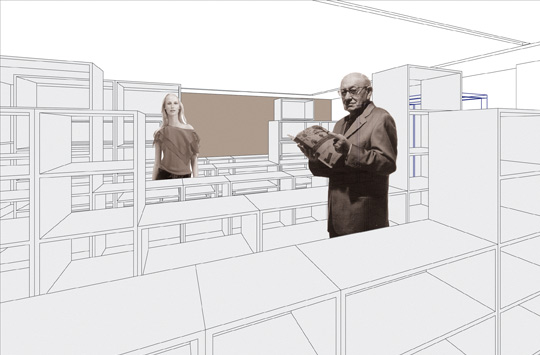
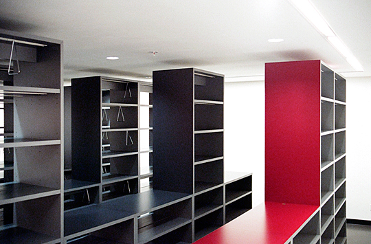
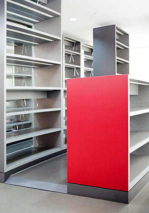
The basic idea behind the design is to work within the existing structure and proportions of the former Post Office to develop a monolithic object in which the books are stored and presented. The object-like furniture is placed in the middle of the room. Its parameters are defined by the existing square-shaped lighting structure set into the ceiling of the room. The furniture is parallel to the transverse direction built in linear sequences varying with shelf and aisle. The abandonment of the surrounding walls allows a non-directional orientation within the space and gives it a surprising generosity and breadth.
The shelves are set onto a base which can occupy the necessary technical infrastructure and gives the object a compact, homogeneous appearance. The on both sides accessible cabinet aisles create a diversified silhouette of higher and lower elements, which turn the library object into a walk-in sculpture, a books and reading landscape.
Two of the three existing individual telephone boxes are joined and converted into a small media lab, the third one inhabits the digitalized catalogue for research purposes. The existing former phone book storage tables are re-used to create the new work surface within the media lab. Mounted touch-screen monitors with different media content and media formats replace the previous telephones along the old structure. Modular, flexible reading tables which relate in their materiality, color and proportion from the object of memory extend the program of the library and are stretching into the public space of the foyer of the Haus der Kulturen der Welt and thus potentially into the whole house.


→ OMA Weimar
Alteration and conversion of the former Weimar customs and land registry office built in 1908 in art nouveau style.
↓ OMA Weimar
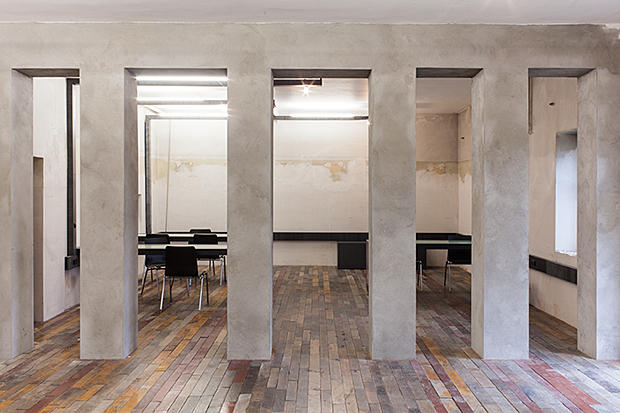
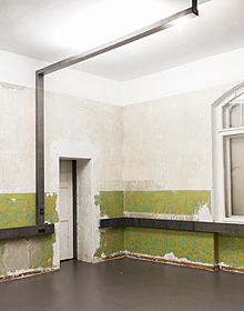
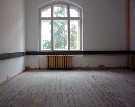
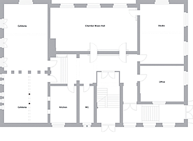
The Other Music Academy (OMA) acts as a think tank for intercultural and interdisciplinary projects and as a creative place for international encounters between artists, scientists and audience (yiddish summer weimar etc.). It is an open experimental place and provides workspace for intercultural, trans-disciplinal and innovative art productions of all kinds.Alterations underdone so far are in particular in the ground floor in which the public part of the intended program will take place: concert space/multipurpose space, kitchen and café. In the next stages seminar and practise rooms in both upper floors and a big multifunctional space in the attic will be established requiring an additional fire escape and a lift for disabled access. In addition the building will meet nowadays required energetic standards, focussing on window up-grading and insulating the roof structure.
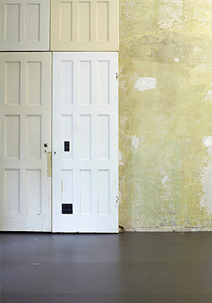
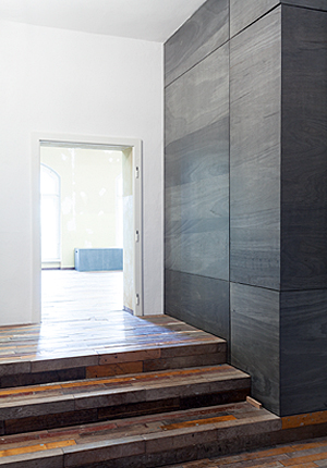
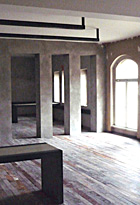
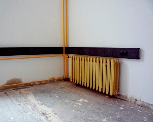
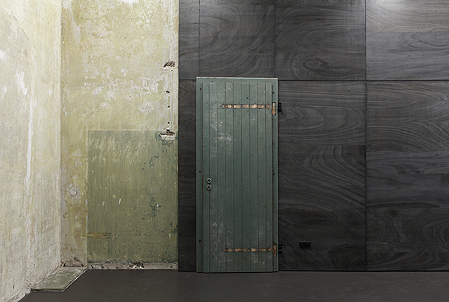
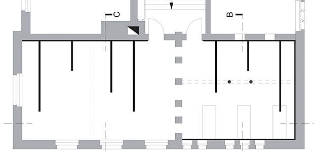
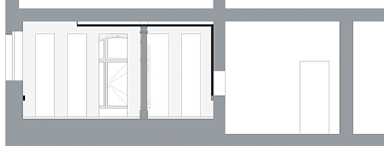
The basic design idea is the framing of the existing spatial and structural elements of the old building. Infrastructural and technical renovations are restricted to minimal interventions. The precise design principle is basically a visual representation of point and line. Mainly new surface mounted elements are taking on the required modernized technical infrastructures, which allow the rich textures and layers of the building’s history to remain and to tell its own story. Those original parts and textures are framed by the linear elements of the new infrastructures.
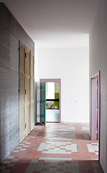
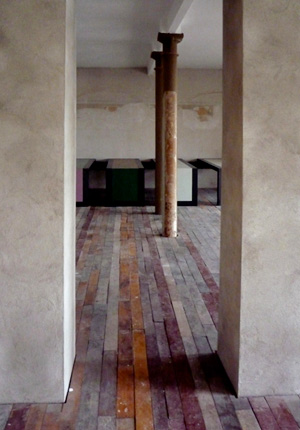
All new interventions are made out of wood and partly combined with the re-use of reclaimed building materials. Old materials have been found within the building itself or sourced locally, taken from its former place and being interpreted to give a new value and purpose in its new context. New timber used will be painted in paynes grey to juxtapose with the re-used materials and to make their different aesthetic and character visible. Paynes grey is a multiplicity of all possible colours and unifies the heterogenous elements of the interventions. The otherness and difference of the materials and surfaces becomes aethetically and tactile perceivable.

→ Apartment L47
The apartment is situated in an existing 70's high-rise building in Berlin Mitte. The reinforced concrete construction allows avoiding load bearing interior walls while offering wide spans.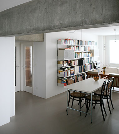
↓ Apartment L47
The apartment is situated in an existing 70's high-rise building in Berlin Mitte. The reinforced concrete construction allows avoiding load bearing interior walls while offering wide spans. Prior to the alterations it had a dark corridor and a seperate kitchen as it was very common in that decade.
Two loggias run over the entire length of the outer walls orientated to the southwest and north. The basic idea is to implement an L-shaped floorplan into the existing structure, dealing with the peculiarities of the apartment and express the programatic of its spatial orientation and loggias.
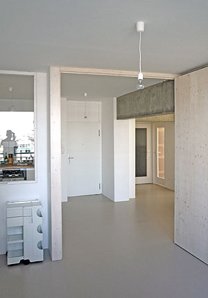
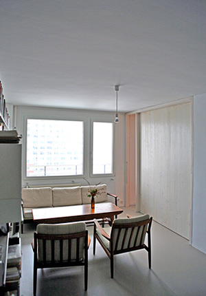
The L is formed by the public rooms of the apartment with the private rooms laterally attached. The large L-shaped communal area is created by connecting the former kitchen, corridor and centre bedroom by removing the existing partition walls. This communal central space is based upon the model of the Scandinavian floor plan.
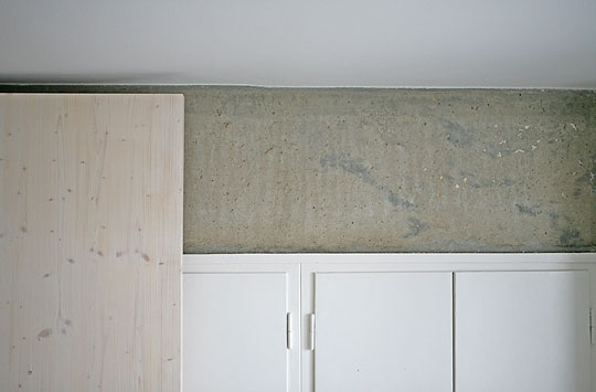
The kitchen is located in the center of the L, where it marks the two lines of sight. One towards the north of the apartment to Berlin- Mitte, the historic center of the city, and one towards the southwest to Friedrichstadt and Grunewald. The horizontality and openness of the apartment is emphazised in materiality by a homogeneous grey beige linoleum flooring in all rooms.
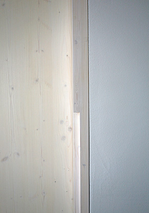
Smooth plastered white walls and exposed concrete beams emphasize the construction of the building and make its structure visible. Large sliding / folding doors connect the more private rooms with the central common spaces and gives the opportunity to open them up and expand the collective space.

→ House F
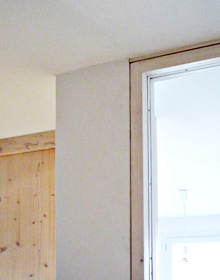
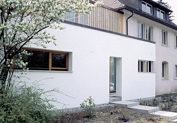
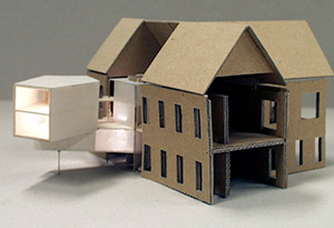
The small house is inserted between two existing buildings from the fifties it is situated in the southern part of Freiburg im Breisgau.
↓ House F
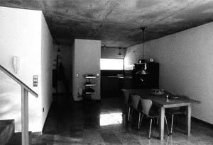
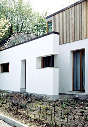
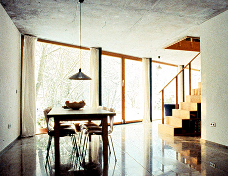
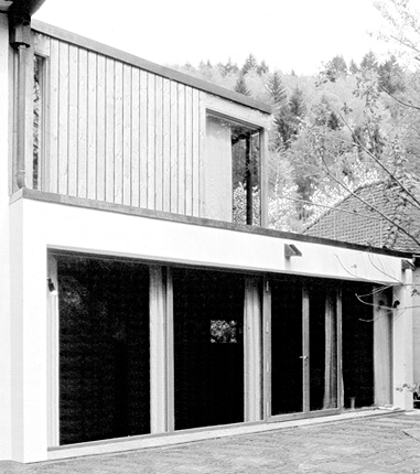
The small house is inserted between two existing buildings from the fifties it is situated in the southern part of Freiburg im Breisgau. The house is conceived as an autonomous unit and is accessed directly from the street which is partly rich in traffic. The parameters of the existing buildings, the beck situated in the southwest, as well as the prescribed building lines led to a nearly self-evident expansion and geometry of the building.The basic structure of the house consists of a bigger ground floor level which is bulit in a massive concrete and brick construction and a smaller upper level which is erected in a wood-frame construction. Both levels are connected with a stair crosswise standing to the house direction. The character of the lower floor is rather open, more extensively while the upper floor is more private and intimate.
The atmosphere of both levels of the house is determined by a particular assigned significant landscape element. The lower level has a small patio filled with water, orientated to the street side. A terrace towards the beck from slate rock extends the house into the old garden. The upper level has a big roof terrace which offers a miraculous view of the mountains of the Black Forest.
The house respects its urban neighborhood and adapts cautiously in the existing ensemble from the fifties, however, architecturally it has a very autonomous and significant appearance.
→ Technology Parc Villach
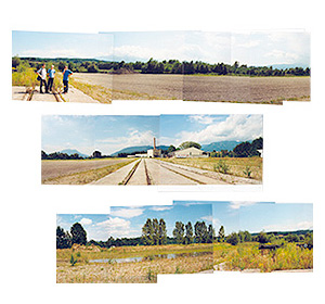
The Technology Parc Villach Sankt Magdalen is a 27,5 ha area of a former paper factory in the north of the town. Ecologically valuable green structures have occupied the fallow industrial scenery and gave a distinct character to the site.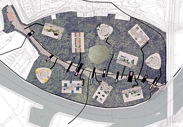
↓ Technology Parc Villach
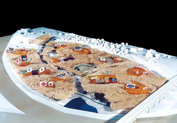
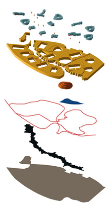
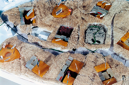
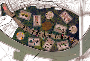
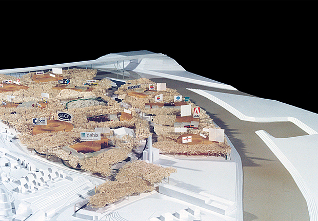
The Technology Parc Villach Sankt Magdalen is a 27,5 ha area of a former paper factory in the north of the town. Ecologically valuable green structures have occupied the fallow industrial scenery and gave a distinct character to the site.The particular regional and ecological qualities are intensified and become the basic idea for the design of the technology parc: an unique ambience for 5000 highly qualified workplaces.The ruderal plant structure of the river terrace is completed to a dense forest like greenery. The construction zones for the enterprises are left blank as islands in the green sea of the new forest. The masterplan determines situation, expansion and quantity of the single islands which are specified regardless of size of company, mode of operation, organisational structure etc. to three optimised types. They are organized through collectively used spaces (patios, roof terraces) which are positioned either in the centre or on the edge of the islands.
The renunciation of the usual showing of an adequate skin creates potential for deeper architectural qualities: a more complex spatial development, the interface between scenery and buildings and a highly elastic organisation lead to a unique spatial ambience. The buildings and enterprises grow symbiotically with the growth of the trees and thus is the programmatic identity of the technology parc produced.
The height of the highway bridge determines the eyepoint of the new horizon originated from the forest. This height of 22 m corresponds to the treetop height of the full-grown forest and the maximum height of the buildings. The logos of the companies guarantee in their relation to the highway a representation at two levels: on the one hand they are advertising medias for the settled single companies (individual representation), on the other hand, they generate an appearance distinctive for the whole parc (collective representation).
Based on this double criterion a special set of rules was developed after parametres of the optical and cognitive perception. The outstanding quality of the technology parc alternates in the dialectic relation between appearance and disappearance. This dialectic produces the unique image of the parc: Aspects of a sustainability together with public and private uses create an outstanding example of an urbanism for the purposes of the 21st century.


→ Tokyobike store
Tokyobike flagship-store for Germany in Berlin-Kreuzberg.
↓ Tokyobike store
Tokyobike flagship-store for Germany in Berlin-Kreuzberg.
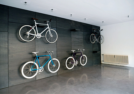
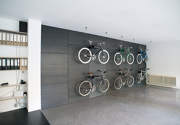
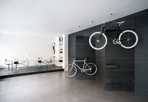
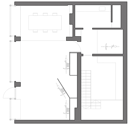
Tokyobike flagship-store Berlin is located off the beaten track but in the heart of Berlin Kreuzberg. It shares its space with the architecture practice StudioCE, which started tokyobike in Germany. The shop reflects their design approach and offers an exclusive backdrop to the minimal design of the bikes and their beauty. It is a very reduced display of the bikes and has little to do with a bike shop as you might be used too.
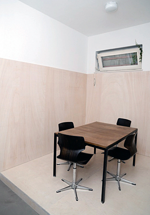
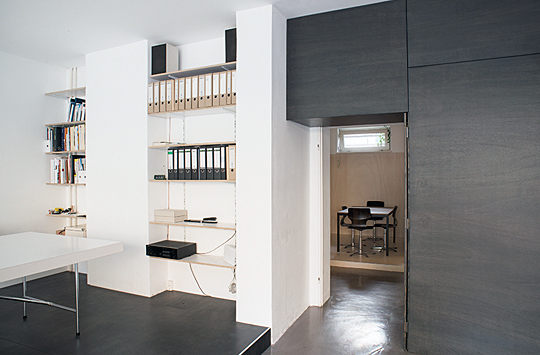
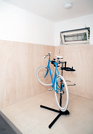
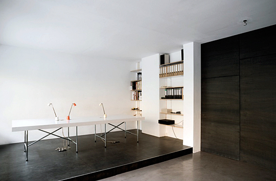
The built in furniture wall out of wood core plywood defines the varies functions within the space. Although being a cheap material it has been finished carefully giving it its exclusive look. The architecture studio itself is positioned on a plateau made from the same material. linking the spaces visually together, but having it separated physically. The wall hides storage space and space for display thanks to three big panel doors. another hidden door is opening the space up to the back, where there is a multi purpose space which is turned into special display area for the bikes, mechanic workshop space or meeting room . Through the door on the left you can also enter the mechanic workshop and storage as well as kitchen/toilet area.
The place combines design in the form of product, as well as the creative process. Customers are amazed by the little hidden germ, which they have not expected when coming to our neighbourhood and love the calm and exclusive touch to the space and the furniture piece. The combination of bike shop and architecture practice has generted interesting cooperations throughout the city and further. The symbioses is working very well and both sides of the business profit from its surrounding.


→ Vienna hospital
The former Garrison Hospital of Vienna is situated at the crossing of two big public green strips. The public space of the greenery overlaps at this point of the town with the specified function of a dental clinic, a conjunction which determines the parametres of the urbanistic intervention.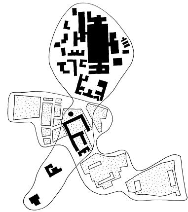
↓ Vienna hospital
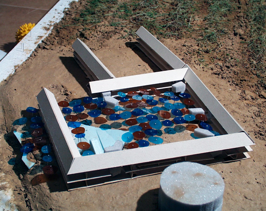
The former Garrison Hospital of Vienna is situated at the crossing of two big public green strips. The public space of the greenery overlaps at this point of the town with the specified function of a dental clinic, a conjunction which determines the parametres of the urbanistic intervention. A precipitous slope manifests the border between two levels: the level of the green space of the courtyard and that of the stoney buildings of the town.The slope is understood as a spatial potential for a dialog between the courtyard and the public space of the street, thereby the repellent character of the existing building is dissolved. The hollow of the slope creates a new connection free of thresholds, a space which mediates by its gentle immersion and emersion between inside and outside. To keep the rooms as empty as possible, the mass of the walls is activated into a service layer which accommodates the serving and infrastructural functions.
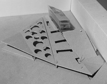
Distinctive interventions concentrate merely upon 5 selective interruptions of the sequential linear structure of the old hospital which correspond to the 5 different stations of the clinic. Inlays which mark the central entrances of the particular station are inserted in these breaks and serve as icons for the orientation of the visitors. Each of the inlays has its own identity and three-dimensionality.
Their spatial organisation stands in contrast to the linearity of the existing building and creates an intensive tie to the inner courtyard with its new landscape character. The existing passageways and paths are taken up and tied together, new paths are added. The cherry grove as well as in particular the herb fields in the corner of the courtyard (catmint, lavender, lemon balm amongst others) create an olfactory antipole to the aseptic smell of the clinic scenery.



→ ZDF Aspekte (TV Studio)
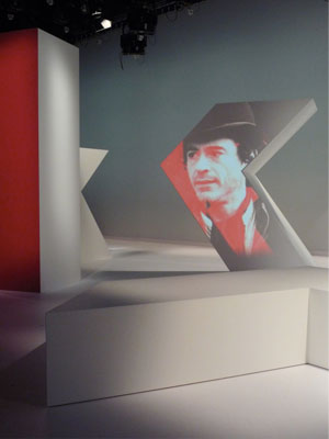
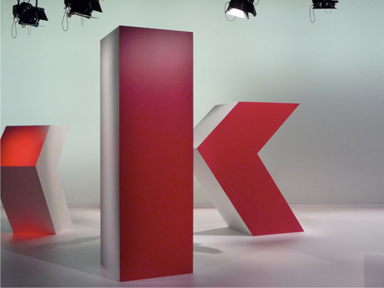
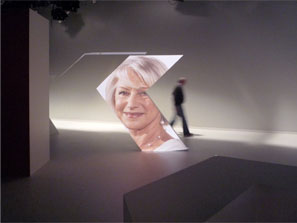
The three-dimensional "K" as a clear and simple guiding principle of the design stands for "culture" [ Kultur] and corresponds to the typographical "K" of Aspekte. By breaking the letter „K“ into its two basic geometric elements it allows to juxtapose the fragments and show how they relate to each other.
↓ ZDF Aspekte (TV Studio)
The three-dimensional "K" as a clear and simple guiding principle of the design stands for "culture" [ Kultur] and corresponds to the typographical "K" of Aspekte. By breaking the letter „K“ into its two basic geometric elements it allows to juxtapose the fragments and show how they late to each other. This can be seen as a basis for a discussion about culture.
Culture produces areas of tension,where Aspekte is now in the middle of it. By arranging the various K- elements into a three-dimensional, sculptural setting it allows to stand inbetween them, to pass or look through. Different camera views and positions allow the two K-fragments in the foreground to join into a clearly visible "K".
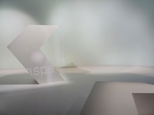
Different angles, different perspectives resulting in various other fragmented impressions. Through the movement of the camera it seems like the elements set off themselves and move to give the show playful, ironic and surprising moments. The "K" can be viewed and used from all sides. Put on its side it can be used as a seating element, for example.
All the elements are related and can create qualitatively different zones. Two parts of a "K" for themselves, as well as an All-Pieces Set, which forms a whole. They create spaces, spaces for movement , spaces for projections. The modular design of the setting corresponds to its serial nature of regularity, in which the show Aspekte is presented for 40 years now.
Collaboration with Thomas Bendel Architekt
